Tooling Around With Text Sentiment: Trump Town Halls
I'm an analyst/data science nerd that thinks learning is fun. This is for me to document and walk through things I tinker with since I learn best by teaching! Professionally I'm a Supervisor of Financial Customer Reporting at a Fortune 500 top 50 company. I have a B.S. degree in MIS and Accounting and I am also currently enrolled in a Business Intelligence & Analytics Master's with a concentration in Data Science.
Previously I've worked on Voice of the Customer, Customer Satisfaction, Call Center Technology & Analysis, and Performance & Incentive programs and systems.
Also I like bouldering, biking, video games, and my dog
Hello World! This is my first article here
Recently I finished up my masters classes in both Python and Data Mining.
And while I enjoy my newly reclaimed time on Mondays, Thursdays and god-knows what days I did homework - I wanted to keep my skills fresh and start tinkering.
In class we had worked with basic sentiment analysis from the RNC/DNC as well as some of the townhalls to plot out scatterplots of sentiment along with polarity:

And while I had completed the assignment as specified, it got me thinking about the differences in speech patterns and how varying modules derive meaning from them. I mean after all, there's a certain amount of context encoded in normal speech and text that humans innately understand. Anyone who has worked with freeform text is familiar with this problem, it's the basis of then entire NLP field!
So with this in mind, and returning to the scatterplot I had turned in for class - I noticed that this visual, while interesting - did a bad job of a few things. Namely, it does a bad job of calling out trends! Every dot on the chart is a sentence plotted at a coordinate of polarity (Good/Bad context) and subjectivity (Fact/Hearsay context). What happens however, when there are multiple statements in the same position on the graph? We lose those points in favor of whatever one was plotted over them. There's a level of context missing here - one that becomes even more complex of a capture when you consider the problems inherent in understanding different forms of speech.
So the scatter plot is a neat visual for a talking point but how can we make it more meaningful?
Problems to Improve Upon:
1. Townhalls are complicated
After all, they're really a free form method of question and answer for candidates that could have anything from political rants to niceties shared with the base. Varying individual performance of either metric here could be misleading!
2. We're dropping out trends in our chart
Assuming someone has a distinct way of speaking - over time the law of large numbers should kick in right? Does length of phrase and frequency muddy this?
3. Data sanitization & text interpretation
Data cleaning is everyone's favorite topic and it becomes a little harder when we're looking at text! Does 'Alright' become a sentence on it's own? Does it have a polarity? Does a module understand text enough to accurately assess, say, a statement involving the social inequalities of the militarization of a police force? (probably not) But these are all things we have to consider when looking at text. Where do data cleaning/formatting problems step out and NLP complexities step in?
In the Spirit of Tinkering, I Didn't Let That Stop Me
I'm not about to try and address an entire field of text parsing/understanding but that doesn't mean I can't improve my chart and maybe learn something!
With this in mind, I went and pulled down transcripts of all of Trump's town halls...I had initially intended to pull this from Rev.com (a seriously great site) myself, but I found some kind soul on Kaggle (Thank you!!) had already compiled and cleaned them up
With the files in place, I opened some up to see the format we were working with:
And you see what's happening, right? It's being rigged against … It's sad. It's being rigged against Crazy Bernie. Crazy Bernie is going to go crazy. Crazy. I think Crazy Bernie is going to be more crazy when they see what they're doing. I called it a long time ago. [... ]The Democrat Party has gone crazy. Whether it's Bernie Sanders plan to eliminate private healthcare, Elizabeth Pocahontas's plan … By the way, she's history. She's history.
Looks like the data has already had the html, speaker tags, time, and speakers other than Trump cleaned out. This is a great starting dataset! Let's get to work loading the actual text into some dataframes. But first, imports!
import os
import requests
from wordcloud import WordCloud
from textblob import TextBlob
from pathlib import Path
import pandas as pd
import seaborn as sns
import matplotlib.pyplot as plt
import matplotlib
from plotly import express as px
from plotly.subplots import make_subplots
import plotly.graph_objects as go
import nltk
import textatistic
(Note that I just ripped out my imports from my class assignment so some of these are unused)
Okay great, so let's point to the files:
directory = r'C:\Users\PATH'
for filename in os.listdir(directory):
    print(filename)
out: BattleCreekDec19_2019.txt
Looks like we have a locale, as well as a date in these townhalls, that might be useful - let's get that bit out and save it later. It could be interesting to see if Trump's speech trends vary over time!
directory = r'C:\Users\PATH\'
capMons = ['J','F','M','A','S','O','N','D']

townDict = {}
polarity = []
subject = []
txt = []
length = []
event = []
for filename in os.listdir(directory):
    #holder for if we've got a double digit date
    doubleMonth = 0
    #searching for the underscore to find the date loc
    endLoc = filename.find('_')
    #search for the period to drop the file extension
    perdLoc = filename.find('.')
    for char in filename[endLoc-4:perdLoc]:
        #checking if we've got a two digit date via string comprehension
        if char in capMons:
            doubleMonth += 1
        else:
            continue
    if doubleMonth == 1:
        #changing how far back we go from the date split char if we have double digit month
        fullMo = filename[endLoc-4:perdLoc].split('_')
    else:
        fullMo = filename[endLoc-5:perdLoc].split('_')
    date = fullMo[0][:3]+'-'+fullMo[0][3:]+'-'+fullMo[1]
    townDict[filename] = date
townDict returns BattleCreekDec19_2019.txt': 'Dec-19-2019'
So now that we've got that bit down, let's move on to the actual content of the files! Putting this under the for loop that we've already go going gets us the data into a dataframe with the polarity and sentiment!
 fullPath = str(directory+'\\'+filename)
    with open(fullPath,'r', encoding='utf8' ) as file:
        #let's read the file!
        townhall = file.readlines()
    #data is coming through as a list, let's fix that
    townhall = str(townhall)
    #there are some break chars coming through, let's get rid of em
    townhall = townhall.replace("\\", "")
    #putting it in a blob for the sentiment analysis
    THblob = TextBlob(townhall)
    #Print overall sentiment and analysis for the entire file:
    print(f'DT Analysis{THblob.sentiment}')
    # Save sentiment data to dataframe
    pd.set_option('max_colwidth', 400)
    for sentence in THblob.sentences: ##getting the Trump text sentiment and putting it in one big data frame
        polarity.append(sentence.sentiment.polarity)
        subject.append(sentence.sentiment.subjectivity)
        txt.append(str(sentence))
## Getting the words in a sentence to understand lenght!
        length.append(textatistic.word_count(str(sentence)))
df_TH = pd.DataFrame(polarity,columns=['polarity'])
df_TH ['subjectivity'] = subject
df_TH ['text'] = txt
df_TH ['len'] = length
Let's check out the data we've got to make sure it's looking good!
df_TH.head()
    polarity    subjectivity    text    len
0    0.0    0.00    ['Thank you.    2
1    0.0    0.00    Thank you.    2
2    0.0    0.00    Thank you to Vice President Pence.    6
3    0.7    0.60    He's a good guy.    4
4    0.8    0.75    We've done a great job together.    6
Looks like we've got some errant chars but it looks like it's only at the overall start and end...let's not worry about that for now! Taking a quick look at the data the same way as my earlier assignment:
fig = px.scatter(df_TH,
                 x = 'polarity' ,
                 y = 'subjectivity',
                 hover_data = ['text'],
                 color = 'len'
                )
fig.show()
Gets us...an image of confirmation that there's a lot of data here
 just from a visual perspective, it looks like the middle right area has a lot of points overlapping...but it's hard to tell. Maybe a heatmap would be a better way to compare all of these speeches!
First let's take a look at the distribution since we're trying to understand how frequently phrases are at certain coordinates:sns.displot(df_TH, x="polarity")

That's a lot of zeroes for polarity, and sentiment doesn't look much better:sns.displot(df_TH, x="subjectivity")

I played around with the length of the sentences vs the polarity and I found that there was a good amount of zeroes at both even with sentences of a len of 25 words(!!!) At this point I think it's safe to say this module might be a little less than ready to handle these speeches but let's move onward since there's still some positives - handling the zero values:
df_Filt = df_TH.loc[df_TH['subjectivity'] !=0]
df_Filt = df_TH.loc[df_TH['polarity'] !=0]
Also a quirk of the seaborn heatplot - our data is in the wrong format, it doesn't really handle multiple entries of a value intelligently. We're going to have to bin values but there's 200 possible values at the .01 rank...let's avoid that and go with .05. We'll have to do a quick function to make this easier!
def round_to(n, precision):
    correction = 0.5 if n >= 0 else -0.5
    return int( n/precision+correction ) * precision

def round_to_05(n):
    return round_to(n, 0.05)

df_ThHeat = pd.DataFrame([df_Filt['polarity'],df_Filt['subjectivity']])
df_ThHeat = df_ThHeat.transpose()
df_ThHeat['polarity'] = df_ThHeat['polarity'].apply(round_to_05)
df_ThHeat['subjectivity'] = df_ThHeat['subjectivity'].apply(round_to_05)
So I snuck in some extra code, but now we've got a dataframe of rounded values so if we just bin similar numbers we'll be good to go!
mytable = df_ThHeat.groupby(['polarity','subjectivity']).size().reset_index().rename(columns={0:'count'})
mytable.transpose()
mytable.head()

But we also need to get the data into the right format, let's set a pivot table to have the right dimensions
df = pd.pivot_table(data = mytable, index='subjectivity',
                  values='count', columns='polarity')
df.fillna(0)
Cool so let's start working with the heatplot!
#Let's set the size of the plot to be bigger so we can see better
plt.gcf().set_size_inches(15, 8)
#white on the back looks a little bad, let's set a gray to attract to a better color
sns.set_style("darkgrid", {"axes.facecolor": ".9"})
#let's make it a bit bigger/better to look at as an image
sns.set_context("poster")
#actual graph stuff, setting min below zero so we get a good color, setting line width to break em out a bit
ax = sns.heatmap(df, cbar=True, cmap='rocket_r', linewidths=.5,
vmin=-50, #vmax=500
#setting robust to True to get a better variety of colors try setting the vmax and see what you get!
# center = mytable['count'].mean(),
robust = True
)
#formatting the lables to look better!
ax.set_xticklabels(['{:.2f}'.format(float(t.get_text())) for t in ax.get_xticklabels()])
ax.set_yticklabels(['{:.2f}'.format(float(t.get_text())) for t in ax.get_yticklabels()])
ax.invert_yaxis()
#Title to finish it up
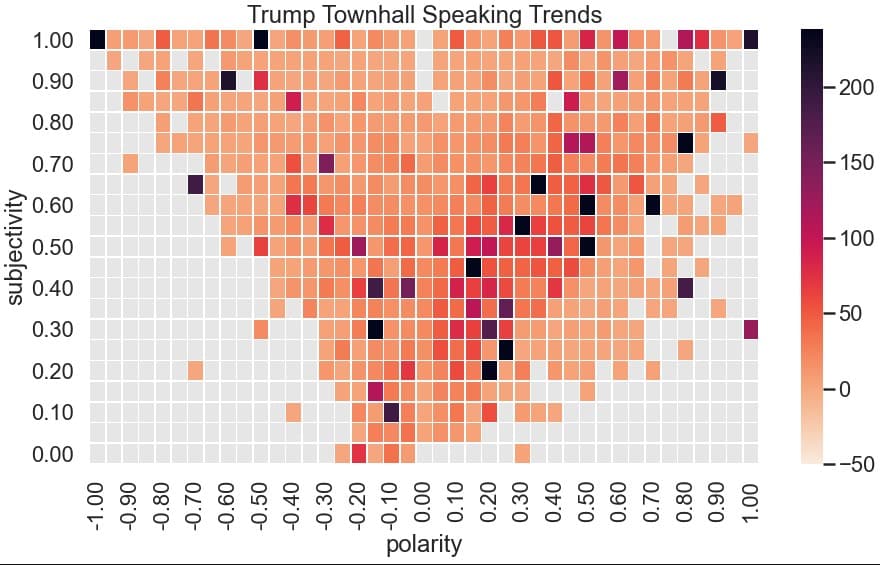
plt.title('Trump Townhall Speaking Trends')

Well now that we've overlaid all of the townhalls, we can see that Trump tends to stay in the middle subjective, slightly positive range but does have a large number of statements in the very subjective and very negative range. In fact, if you bump up the vmax on the graph to make more extreme data stand out more - you see that he's got a lot of statements in that range
Wrapping Up & Closing Thoughts
Trump's got a very unique circular speaking style that tends to be self-referential. I wonder how much of the fallout is due to this and how much is a failure on the module I've used. I should be able to recreate this with a different module.
Other random thoughts:
I could use length to weight the instances of polarity and subjectivity to try and capture the sentiment of more complex thoughts - this might tease out better trends
I'm going to run this for Biden as well to see if there are different trends
- I could create a 'difference' heatmap showing differences in trends via matrix subtraction between Biden and Trump's heatmaps to visualize if they tend to speak in different quadrants
I learned a lot with this one and had some fun tinkering!